REVAMPING NAVIGATION FOR A GROWING ENTERPRISE PLATFORM
As our product started to grow from a small startup into a robust, enterprise-ready tool, we needed to make sure our web app structure was up to the challenge. Over the decade, a proliferation of functional and administrative pages necessitated a critical re-evaluation of our information architecture. Unlike many redesign projects which are driven by immediate business needs or executive mandates, this was a strategic initiative aimed at enhancing the user experience and long-term scalability of our platform.
PROBLEM WITH CURRENT NAVIGATION
Our existing three-click navigation panel posed challenges for users, leading to ambiguity and increased cognitive load. Users often struggled to remember the navigation structure or found themselves clicking multiple times to locate desired pages. Additionally, the search function did not effectively support page discovery, further hindering efficiency.

Old Navigation, three panel approach
GOALS
Our goal was to create a scalable navigation structure that can fit the Platform growth while increasing content discoverability.
OUR RESEARCH APPROACH
Our product team wanted to expedite the process and, given the wealth of user feedback we'd gathered over time, we decided to focus on internal resources. Instead of reaching out to external clients, I conducted in-depth interviews with our internal users across various teams to gather insights for our ideation and design phases. We began by thoroughly analyzing our existing navigation structure and reviewing relevant studies on multi-level navigation. Next, we planned and conducted a card sorting exercise. I led a workshop with members of our product and leadership teams to collectively agree on updating our Information Architecture (IA) for better scalability. We renamed submenus to clarify their purpose, aligned terminology across the system, and established distinct categories to organize content under three headings: functional, system setup, and administrative.


IDEATION AND DESIGN CHALLENGES
With the ground work ready, we moved on to the design phase. There was an unanimous agreement to explore an exposed navigation design, such that our users had transparency on all available content.
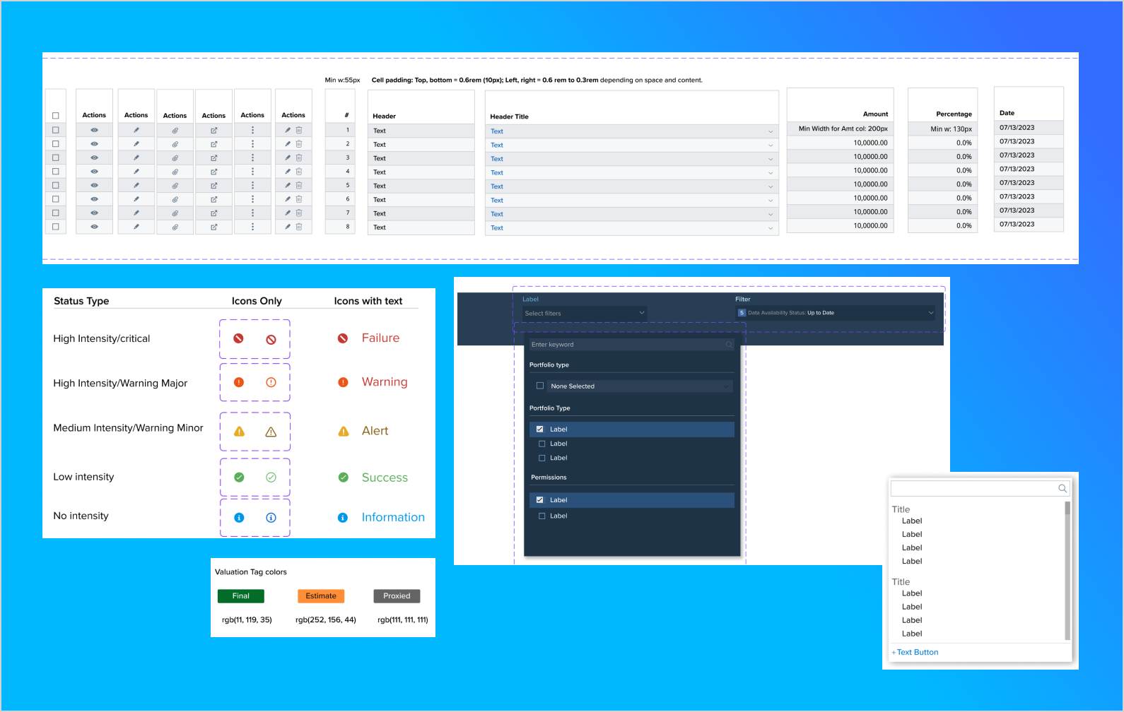
The core design challenge was to redesign only the header component of the UI and create a design which would work with existing page layouts. We made sure that we reused elements from our current UI library for faster implementation and to retain consistency.
Visual design
We created many design versions of what the flyout mega menu would look like and how it would be accessed from the global header, pitching pros and cons of each design to leadership teams, guiding decision making.
Search wizard design
Our product's depth and breadth make search a central feature for content discovery. Drawing on industry insights, we created a 'focused search' design. You can now quickly search by pressing a key, and the results include submenus, portfolios, and funds. This makes it a breeze to find what you're looking for. We also made sure that the search results are up-to-date with all the latest changes, and we even kept some old names around to make it easier for you to find things.
Here's what the visual design components look like all together on the page layout:

Focused Search with results including old and new page names
Here's what the redesign looked like:

Redesigned Navigation
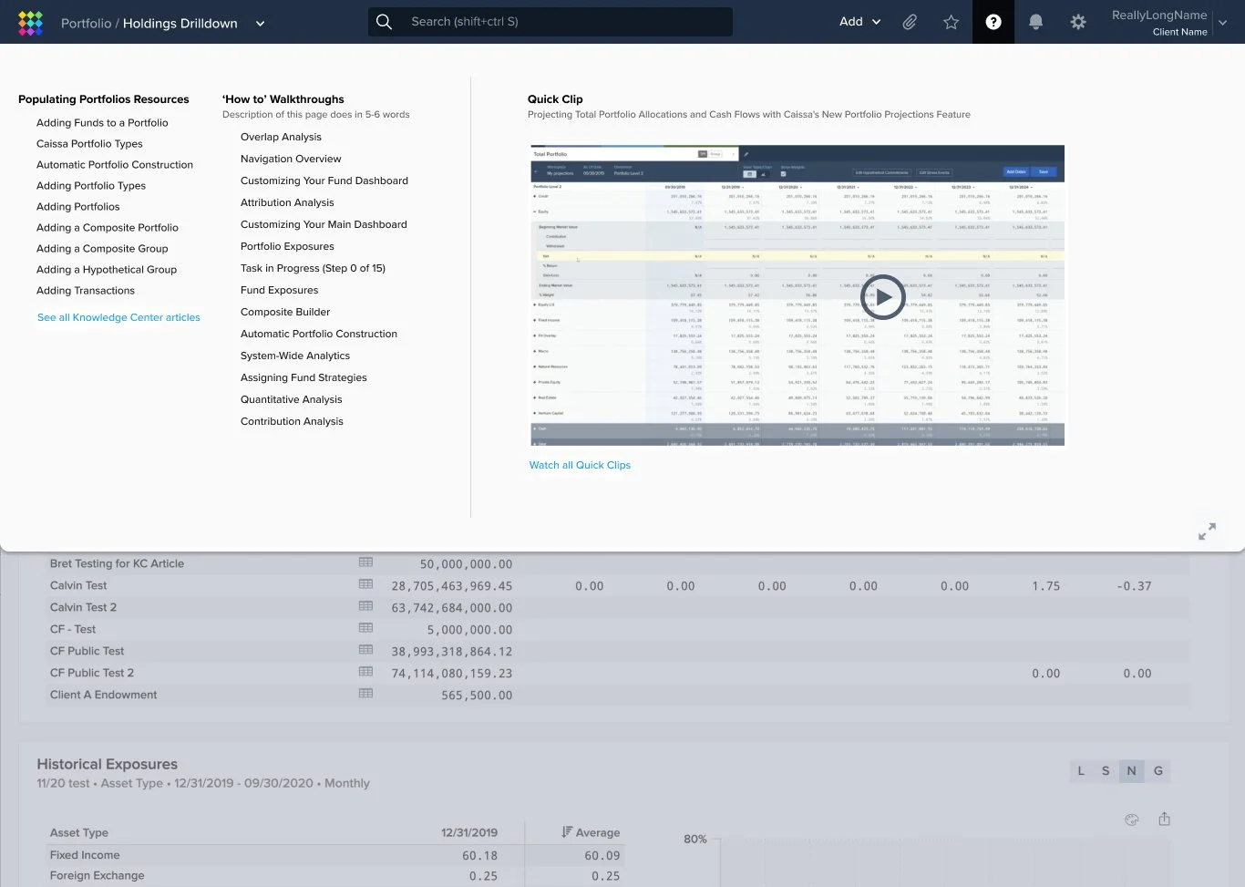
Vision to include Quick Clips on mega menu
IMPLEMENTATION CHALLENGES
Just as we were about to launch the redesigned navigation, there was a company acquisition, which changed our plans. We had to rethink how to implement and release the new design. We split the new features into smaller parts, releasing core features like the global Add button and search improvements to everyone using our old interface. At the same time, we started using the new design internally. This extra time gave us a chance to get feedback from users and test how well the new design worked.

OUTCOME
Reduced Clicks: The redesigned navigation significantly reduced the number of clicks required to reach desired pages, improving efficiency and user satisfaction.
Enhanced Discoverability: The exposed navigation and focused search functionality made it easier for users to find and access content, reducing cognitive load and increasing productivity.
Improved User Experience: The overall user experience was enhanced through a more intuitive and efficient navigation system, leading to increased satisfaction and engagement.
Scalability: The new navigation structure is designed to accommodate future growth and changes in our product offerings, ensuring long-term sustainability.
CONCLUSION
The successful redesign of our platform's navigation has significantly improved user experience, increased content discoverability, and positioned the platform for long-term scalability. By addressing the challenges posed by the previous navigation structure, we have empowered users to navigate the platform more efficiently and effectively.
Additional Case Studies

Report Builder Tool

User Management
Design System